How do I create and edit Context cards?
Context cards can be moved around the Context Sharing page by simply dragging them to the desired position. They can be created or edited easily.
How do I create a new context card?
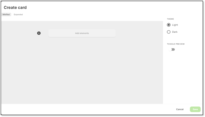
Click on the green circle in the top right-hand corner.
Note – When viewing the context sharing page, it is possible to click on a card and expand the view. When you create a context card, you can choose what is seen in both the minified (default) and expanded views.
How do I create context card elements?
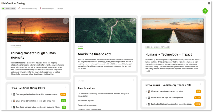
- You can create your context Card choosing from 2 Themes - Light or Dark.
- Your Context Card has two view options:
- The Minified or standard view which is how it appears within the context Sharing Page.
- You can also click on a Context Card so it can be Expanded.
See Below: How do I edit Context Card elements, for more detail on Minified & Expanded Views
Click on ‘+’ to add elements to the context card.
Elements refer to the content you want to put into the Context Card.
You can add:
- Text
- Media
- Status
- Divider
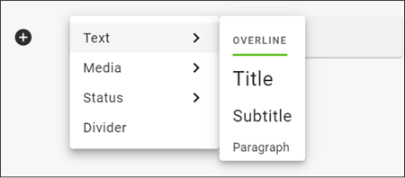
- There are 4 text elements
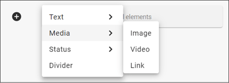
- There are 3 Media elements
- There are 3 Status elements for the Organisation Context Sharing page
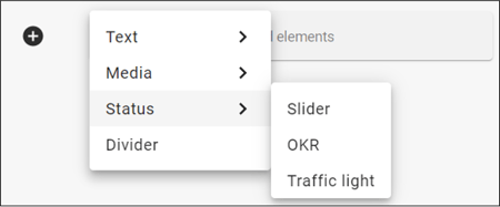
- There are 4 Status elements for the team Context Sharing page.
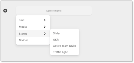
- The Divider has only one element and no options
All the elements are easy to create and edit.
Just one element, the transformation sliders, may need a small explanation.
The slider compares two, often contrasting states - an example of two contrasting states could be Control and Autonomy.

The black circle represents your current position and the green flag, your future position.
You slide these icons along the line to show your current position and desired future position.
How do I edit context card elements?
Click on the 3 dots on the top right hand corner of the Context Card to edit or remove the card.
The card below has 3 elements, an overline, a picture and a paragraph.
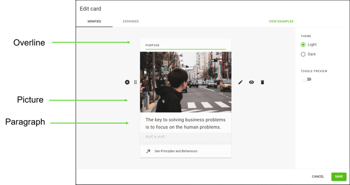
If we choose to edit the picture element, you have 4 options in addition to the ‘+’.

![]() Grab your element and move it around the card in relation to the other elements you have added.
Grab your element and move it around the card in relation to the other elements you have added.
![]() Crop images and edit web links and video links.
Crop images and edit web links and video links.
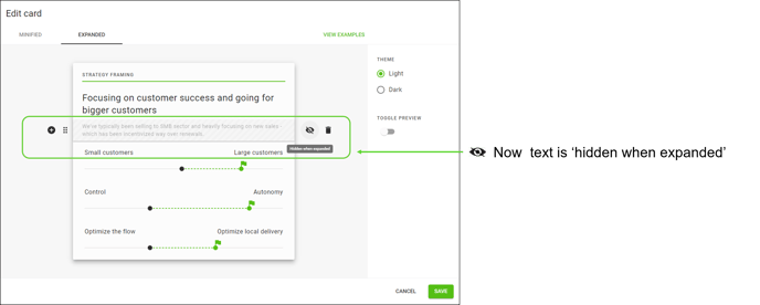
![]() Choose what is visible in the Minified (default) view of the card and also the Expanded view.
Choose what is visible in the Minified (default) view of the card and also the Expanded view.
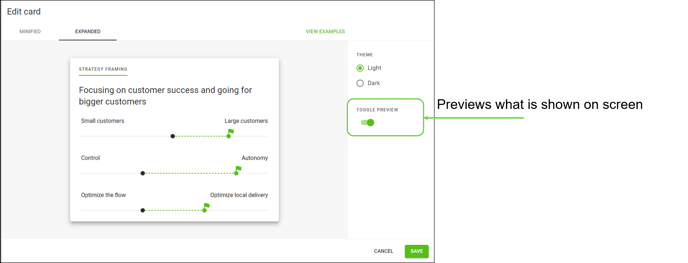
When you have chosen to view or hide an element, the Toggle Preview option allows you to preview what you have chosen.
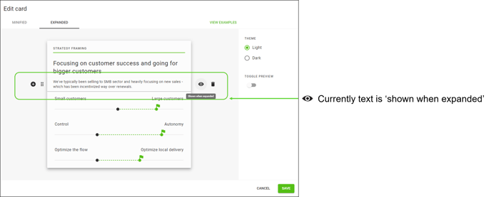
For example, this context card has 6 elements:
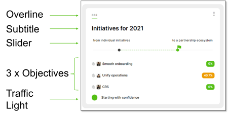
Let's say we want to hide the Paragraph text in the Expanded View:
![]() Click the Bin to remove the element from the card.
Click the Bin to remove the element from the card.
